Title and statement of responsibility area
Title proper
Dutch Sisters Inn, Smorgasbord Lobby.
General material designation
- Graphic material
Parallel title
Other title information
Title statements of responsibility
Title notes
Level of description
Item
Repository
Reference code
Edition area
Edition statement
Edition statement of responsibility
Class of material specific details area
Statement of scale (cartographic)
Statement of projection (cartographic)
Statement of coordinates (cartographic)
Statement of scale (architectural)
Issuing jurisdiction and denomination (philatelic)
Dates of creation area
Date(s)
-
1950-1954 (Creation)
- Creator
- The Photogelatine Engraving Co. Ltd.
- Place
- Toronto, Ontario, Canada
Physical description area
Physical description
2023.000.19: Postcard
Publisher's series area
Title proper of publisher's series
Parallel titles of publisher's series
Other title information of publisher's series
Statement of responsibility relating to publisher's series
Numbering within publisher's series
Note on publisher's series
Archival description area
Name of creator
Biographical history
Custodial history
Scope and content
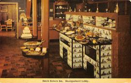
Front: The front image is captioned “Dutch Sisters Inn, Smorgasbord Lobby” and features a full color image. The image depicts an interior room with multiple surfaces offering food in a buffet style. In the front left, a small table holds several types of bread and a large bowl of what appears to be salad. Also on the left, towards the midground of the image is a similar table that holds a white, multi-tiered object that may be a Smörgåstårta (Swedish Sandwich Cake.) A longer counter on the right side of the image holds an assortment of meats and other unidentifiable food items. Towards the back is a counter that appears to hold a cash register, and through a doorway a dining room with several chairs can be seen. The floor is finished in muted red and black tiles, and much of the furniture and fixtures are made of light brown wood. The counter holding the meat is decorated with wallpaper featuring windmills.
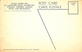
Back: Divided back - dividing line is stylized, continuing horizontally towards the center of the postcard from the rectangle comprising the stamp box, and then slants diagonally downwards towards a point approximately two thirds of the way across the card, ending on the right hand side at the bottom. Text along the top of the card reads "DUTCH SISTERS INN, 227 LAKESHORE ROAD, HUMBER BAY, TORONTO, ONTARIO, CANADA MOTEL AND RESTAURANT." Below this reads "A GENUINE KODOCHROME REPRODUCTION." Alongside this block of text is "POST CARD CARTE POSTALE." At the bottom of the postcard is the branding: "THE PHOTOGELATINE ENGRAVING CO. LTD. TORONTO." All of the text and details are printed in blue ink.
Notes area
Physical condition
Immediate source of acquisition
Arrangement
Language of material
Script of material
Language and script note
Mark / Inscription text:
(1) Dutch Sisters Inn, Smorgasbord Lobby
(2) DUTCH SISTERS INN, / 227 LAKESHORE ROAD, HUMBER BAY, / TORONTO, ONTARIO, CANADA / MOTEL AND RESTAURANT
(3) A GENUINE KODOCHROME REPRODUCTION
(4) POST CARD / CARTE POSTALE
(5) STAMP HERE
(6) (Line art - no text)
(7) THE PHOTOGELATINE ENGRAVING CO. LTD. TORONTO
Mark / Inscription type:
(1) Image title
(2) Image description
(3) Film branding
(4) Object identification
(5) Stamp box
(6) Back divider
(7) Publisher branding
Mark / Inscription description:
(5) A rectangular outline
(6) A horizontal line that turns an acute angle to proceed diagonally downwards
Mark / Inscription technique: (1-7) Printed, blue ink
Mark / Inscription position:
(1) Front: bottom center
(2) Back: Upper left corner
(3) Back: Upper left corner, immediately below 2
(4) Back: Upper center right, between 3 and 5
(5) Back: Upper right corner
(6) Back: From left edge of 5 near upper right corner to lower edge, just right of center
(7) Back: Lower left edge
Mark / Inscription language: English
Mark / Inscription translation: N/A
Location of originals
Availability of other formats
Restrictions on access
Terms governing use, reproduction, and publication
Finding aids
Associated materials
Accruals
Accompanying material
The Photogelatine Engraving Co. Ltd. (or PECO) was founded by Rowley Shillito Hooper of Dudley, England. He came to Ottawa in 1915 to fill a position as a factory superintendent at an Ottawa-based printing firm (Rolla L. Crain Company, Ltd.). Two years later, he left the firm and established his own printing business. The Photogelatine Engraving Company was incorporated in Ottawa on June 18, 1920. “A used Photogelatine Engraving Co., Ottawa postcard, found with the date July 21, 1921, would confirm that the business was up and operating by the summer of 1921.” (Toronto Postcard Company). The PECO opened a branch In Toronto in 1926 and in 1947, PECO fully moved to Toronto. Rowley Shillito Hooper died June 16, 1951. In 1952, he was replaced as president and general manager by Robert D. Church. PECO closed in 1954.
PECO published postcards with images from communities all across Canada and even those from as far away as the British West Indies (however, images were of Ottawa were the largest collection they published – 41 out of 497). “The postcards, whether monotone black, monotone green, or full colour, were printed on a matte card stock and most had a wide white border.” (Toronto Postcard Club). The early printing methods by PECO was a gelatine process, similar to the “Bromoil” bromide process used in photography. “The postcards are generally recognizable today because of the diffuse detail. Under magnification there is limited resolution and broad tonal effects – not the tiny squares, or dots found with half-tone illustration.” (Toronto Postcard Club). The earliest postcards printed by Photogelatine Engraving Co. (1921-1929) were white border designs in monotone black or monotone green tints with hand written captions on the image. In 1930, Photogelatine Engraving Co. introduced a line of white border, full colour postcards. Different than the previous postcards, the caption was printed in the border of the design. Beginning in 1947, postcards produced by PECO carry a Toronto address. “Most of the postcards produced in this period are reprints of earlier white border gelatine colour, monotone black and sepia designs. Early in the 1950s the firm introduced a different type of postcard. The white border, which had become a trademark of the Company over the years, was dropped in favour of an image occupying the entire front and the caption was removed to the back.” (Toronto Postcard Club).
The Dutch Sisters Inn was located at 227 Lakeshore Road in the Humber Bay area. It was opened by Hans and Anna Sachau who immigrated to Canada from Germany in 1928. In 1931, Hans was a former Naval architect who founded the Sachau Marine Construction which built various types of boats. In the late 1930s or early 1940s Anna started a breakfast counter/restaurant on their property called The Dutch Sisters Restuarant with the name coming from their three daughters Greta, Elisabeth, and Elsa-Ann. While the family was German and not Dutch, the use of Dutch in the title was due to the ongoing war where references to Germany should be avoided. In the early 1950s, the couple converted the restaurant to the Dutch Sisters Inn. The restaurant specialized in German and seafood dishes and was well known for its desserts. In 1958, Hans died but the restaurant remained in operation by his executors until 1969. The property was sold and was rebuilt under a Spanish style and reopened as the Casa Mendoza, a restaurant with influence from middle Europe and Argentina.
In the 1940s-1960s, Etobicoke saw a rise in motels due to motor vehicles becoming more accessible and widely used. Motor hotels (motels) became prominent tourist destinations. Etobicoke Lakeshore’s prime motel era is seen in many postcards from the time period (primarily shots from Mimico and New Toronto). “Replacing the traditional cottage industry in Long Branch, local sites hosted waterfront beaches, attractions, and quaint motels with easy and affordable access for local tourists following Lakeshore Road as the main link between East (Toronto), and the West (Buffalo and Niagara Falls) along the shoreline. Construction of the 401 and QEW diverted traffic away from the Lakeshore, causing a steep decline in Mimico’s motel industry in the 1980s, with the last structure demolished in 2012. Many of these sites were replaced by condos as tourism moved away from the area.” (LGIC). Casa Mendoza closed in 2012 and was replaced by a condo tower.


