Item 2023.000.13 - Grounds and Office Building

2023.000.13 - Front 2023.000.13 - Back

Title and statement of responsibility area

Title proper

Grounds and Office Building

General material designation

  • Graphic material

Parallel title

Other title information

Title statements of responsibility

Title notes

Level of description

Item

Reference code

CA LGIC ARC-2023.000.13

Edition area

Edition statement

Edition statement of responsibility

Class of material specific details area

Statement of scale (cartographic)

Statement of projection (cartographic)

Statement of coordinates (cartographic)

Statement of scale (architectural)

Issuing jurisdiction and denomination (philatelic)

Dates of creation area

Date(s)

  • 1909 (Creation)
    Creator
    The Valentine & Sons Publishing Co. Ltd.
    Place
    Great Britain

Physical description area

Physical description

2023.000.13: Postcard

Publisher's series area

Title proper of publisher's series

Parallel titles of publisher's series

Other title information of publisher's series

Statement of responsibility relating to publisher's series

Numbering within publisher's series

Note on publisher's series

Archival description area

Name of creator

Custodial history

Scope and content

Front: Colour picture – Mimico Branch Asylum in the early 1900s. To the left of the image are dark, bushy trees and a green, manicured lawn. To the right of the image is a large shrub that covers part of a large red brick building with peaks and many windows. The lawn features several small flower beds and a light tan stone or dirt walkway. At the end of the walkway, what looks to be a human figure can be seen, possibly a statue. In the upper left of the postcard, printed over the trees, text on the image reads: “Grounds and Office. Mimico Asylum, Toronto, Canada.” In the lower right corner is the identifying code “104 071” and in a small circle the letters “JV.”

Back: Divided back. Some printed text identifies the maker as Valentine & Sons Publishing. Handwritten text in black ink addresses the card to Miss Lara Day, with a note from Aunt Grace(?). It is postmarked April 19 in Outlook, Saskatchewan. It bears an upside down 1903 King Edward VII 3/4 profile 1 cent stamp.

Notes area

Physical condition

Immediate source of acquisition

Arrangement

Language of material

Script of material

Language and script note

Mark / Inscription text:
(1) Grounds and Office Building. / Mimico Asylum, Toronto, Canada.
(2) 104 071 JV
(3) The Valentine & Sons Publishing Co. Ltd. Montreal and Toronto / Printed in Great Britain
(4) Correspondence
(5) FAMOUS / POST V & SONS CARD / THROUGHOUT THE WORLD
(6) OUTLOOK / AP 1 / S
(7) Address Only
(8) CANADA POSTAGE / ONE CENT / 1 1
(9) I wrote a letter to your mama / a week ago but have not / got it posted yet. The ferry / is not running yet, have / not got my trunk yet. / I was up to church today / having nice weather, had a / storm last week but nice / again. They are started / seeding. The snow is all / gone. Arthur has had the grippe / for a week. Sam's all had it / babe is not well yet has / very sore eyes. Retta only went / to school two days and came / home sick but she is better now.
(10) Miss Lara Day / Walter's Falls / Ont. / c/o A. Day
(11) From / Aunt Arema
(12) ((Easter Sunday))
(13) OUTLOOK / AP 19 / 11 / SASK
Mark / Inscription type:
(1) Picture title
(2) Photo ID code
(3) Publisher info
(4) Instructions for postcard side use
(5) Branding
(6) Postmark
(7) Instructions for postcard side use
(8) Postage stamp
(9) Message
(10) Address  
(11) Message
(12) Message
(13) Postmark
Mark / Inscription description:
(2) Photo ID code ends with letters JV in circle
(5) Branding logo “V & Sons” superimposed on double-sided globe
(6) Postmark consisting of circle with interior text
(8) Stamp features 3/4 profile of King Edward VII in green
(13) Postmark consisting of circle with interior text
Mark / Inscription technique:
(1) Printed, white ink
(2-5) Printed, black ink
(6) Stamped, black ink
(7) Printed, black ink
(8) Printed, colour ink
(9-12) Handwritten cursive, black ink   
(13) Stamped, black ink    
Mark / Inscription position:
(1) Front of card, upper left
(2) Front of card, lower right
(3) Back of card, vertically along left edge
(4) Back of card, diagonally in upper left
(5) Back of card, horizontally along top edge, centered
(6) Back of card, near top edge from center to right edge of card. Text runs horizontally. Partially covers 5 and 7
(7) Back of card, horizontally in upper right quadrant, between 5 and 8
(8) Back of card, upper right corner
(9) Back of card, horizontally from top to bottom. Text covers entire left half.
(10) Back of card, diagonally towards center in lower right quadrant
(11) Back of card, upside down and running diagonally (bottom of text towards 12) towards the center of the card.
(12) Back of card, written upside down at the top center of the card
(13) Back of card, top right corner, partially over 8     
Mark / Inscription language: English      
Mark / Inscription translation: N/A

Location of originals

Availability of other formats

Restrictions on access

Terms governing use, reproduction, and publication

Finding aids

Associated materials

Related materials

Accruals

Accompanying material

This postcard was created and printed by The Valentine & Sons Co., Ltd. Valentine & Sons was a Dundee, Scotland based printing company originally founded in 1825 but did not begin to print postcards until the 1890s. Valentine & Sons first began production of Canadian postcards in 1903 when the company sent a photographer to Montreal. A few years later a Montreal office was formed, followed by offices in Toronto, Vancouver, and Winnipeg. In 1909, the Canadian offices became independent were run under the company name of The Valentine & Sons Publishing Co. Ltd. The first Canadian postcards published by Valentine & Sons were monotone black, collotype postcards featuring photos of scenery along the main line of the Canadian Pacific Railway, north of Lake Superior, as well as scenes in the Rocky Mountains. The tinted halftone and collotype postcards continued to be printed in Great Britain. The main company closed offices in Canada in 1923 but remained focus on printing postcards. (It is important to note that in 1926, the Canadian company split into two: the Toronto-based Valentine Black and the Winnipeg-based Valentine Edy. The two companies continued to reproduce some of the existing images, but Valentine Edy, in particular, adopted new numbering systems in its later years. The Valentine Edy Co. ceased operations in 1957, followed by Valentine Black in 1964.) However, by the 1950s Valentines & Sons, despite the rise of coloured postcards, were producing greeting cards and as a result, the business was struggling. They were eventually purchased by John Waddington & Co. in 1963 and subsequently sold to Hallmark Cards in 1980. In 1994, the Dundee office officially closed.

Typically, Valentine postcards have a 6-digit serial number (###,###) on the view side with the initials “J.V.” in a circle adjacent to that number. The main series of numbering begins with a Halifax card as no. 100,000 and ends (as far as we know) with a postcard of Toronto as no. 115,981. Other relevant codes are the 400,000s and the 600,000s as there are also two short runs of numbers in the 400,000 range that are found on some cards from the Yukon Territory and a longer run of views from various parts of Canada that begins at 600,000 and continues past 602,000. Other countries and areas received various other codes. Typically, the images numbered from the 100,000s through the 105,000s are the most common.

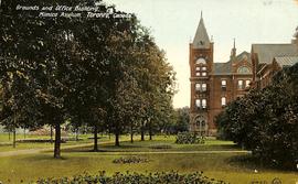
In relation to this postcard, a rough guide was created by The Toronto Postcard Club using a small sample of Valentine & Sons cards. It is important to note that the dates indicated are those of the earliest postmark in the sample. The number on this card is 104,071 which, based on this rough guide, was likely created around July 1909.

This postcard is printed in the half-tone printing style. Half-tone was the cheaper option than the other popular printing method of collotype images. Collotypes was a gelatine-based printing process used between the late 19th and early 20th century to reproduce photographic images on a printing press. These could be left black and white or colourized by directly adding colour to the image. Half-tone prints were cheaper and easier to produce. They are composed of ranges of little dots to create the image. Half-tone prints often look less realistic and “duller”.

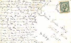
Based on the postmarks found on the object, this postcard was sent from Outlook, Saskatchewan on April 19, 1911 to a Miss Clara Day in Walter’s Falls. The letter was written on Easter Day (April 16). The stamp used is a Canadian 1903 King Edward VII 1cent stamp.

Alternative identifier(s)

Standard number area

Standard number

Access points

Subject access points

Place access points

Name access points

Genre access points

Control area

Description record identifier

Institution identifier

Rules or conventions

Status

Level of detail

Dates of creation, revision and deletion

Language of description

Script of description

Sources

Accession area

Related subjects

Related people and organizations

Related places

Related genres