
Title and statement of responsibility area
Title proper
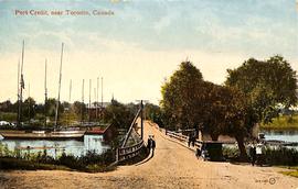
Port Credit, near Toronto, Canada
General material designation
- Graphic material
Parallel title
Other title information
Title statements of responsibility
Title notes
Level of description
Item
Repository
Reference code
Edition area
Edition statement
Edition statement of responsibility
Class of material specific details area
Statement of scale (cartographic)
Statement of projection (cartographic)
Statement of coordinates (cartographic)
Statement of scale (architectural)
Issuing jurisdiction and denomination (philatelic)
Dates of creation area
Date(s)
-
1909 (Creation)
- Creator
- The Valentine & Sons Publishing Co. Ltd.
- Place
- Great Britain
Physical description area
Physical description
2020.009.01: Postcard
Publisher's series area
Title proper of publisher's series
Parallel titles of publisher's series
Other title information of publisher's series
Statement of responsibility relating to publisher's series
Numbering within publisher's series
Note on publisher's series
Archival description area
Name of creator
Biographical history
Custodial history
Scope and content
Front: Colour picture. The top of the image is a blue fading into white/beige sky. On the left, there are multiple boats in a small body of water. Behind the boats on the horizon there are a few red buildings surrounded by green grass and some trees. In the middle of the image, there is a light brown/tan pathway with a light red three rowed barrier on either side. On the left side of the pathway near the start of the bridge, there are two women in dresses and a hat walking away from the water. Behind the two women walking, there are two wooden electricty/telegraph poles. Part of the path is a bridge going over water. Beside the bridge, there is a small brown house-like structure on the water. On the other side of the bridge, there are two men walking towards the water with a blue car close behind, as well as a man and woman going in the opposite direction. On the right of the photo, there atre three trees and a small pond. The pond has a structure and a dock or small boats. The bottom of the image is just a continution of the path. In the lower right corner is the identifying code “104 483” and in a small circle the letters “JV.”
Back: Divided back. Some printed text identifies the maker as Valentine & Sons Publishing on the left. On the top right corner, there is a rectangle for a stamp. Along the top in the middle, there is some text and two globes. Below the text, there is a vertical line dividing the page in half.
Notes area
Physical condition
Immediate source of acquisition
Arrangement
Language of material
Script of material
Language and script note
Mark / Inscription text: Port Credit, near Toronto, Ontario
Mark / Inscription type: Picture title
Mark / Inscription description:
Mark / Inscription technique: Printed, orangeish-red ink
Mark / Inscription position: Along the top left on the front
Mark / Inscription language: English
Mark / Inscription translation: N/A
Mark / Inscription text: 104 483 J.V.
Mark / Inscription type: Serial number
Mark / Inscription description: The “J.V.” is encircled
Mark / Inscription technique: Printed, black ink
Mark / Inscription position: Along the bottom right corner on the front
Mark / Inscription language: English
Mark / Inscription translation: N/A
Mark / Inscription text: The Valentine & Sons Publishing Co. Ltd. Montreal and Toronto / Printed in Great Britain
Mark / Inscription type: Publisher name/makers mark
Mark / Inscription description:
Mark / Inscription technique: Printed, grey ink
Mark / Inscription position: Back of card, vertically along left edge
Mark / Inscription language: English
Mark / Inscription translation: N/A
Mark / Inscription text: Correspondence
Mark / Inscription type: Instructions for postcard side use
Mark / Inscription description:
Mark / Inscription technique: Printed, grey ink
Mark / Inscription position: Back of card, diagonally in upper left
Mark / Inscription language: English
Mark / Inscription translation: N/A
Mark / Inscription text: FAMOUS / POST V & SONS CARD / THROUGHOUT THE WORLD
Mark / Inscription type: Branding
Mark / Inscription description: Branding logo “V & Sons” superimposed on double-sided globe
Mark / Inscription technique: Printed, grey ink
Mark / Inscription position: Back of card, horizontally along top edge, centered
Mark / Inscription language: English
Mark / Inscription translation: N/A
Mark / Inscription text: Address Only
Mark / Inscription type: Instructions for postcard side use
Mark / Inscription description:
Mark / Inscription technique: Printed, grey ink
Mark / Inscription position: Back of card, horizontally in upper right quadrant
Mark / Inscription language: English
Mark / Inscription translation: N/A
Mark / Inscription text: 2 / BRITISH / MANUFACTURE
Mark / Inscription type: Stamp box
Mark / Inscription description: Text is within a rectangle
Mark / Inscription technique: Printed, grey ink
Mark / Inscription position: Back of card, upper right corner
Mark / Inscription language: English
Mark / Inscription translation: N/A
Location of originals
Availability of other formats
Restrictions on access
Terms governing use, reproduction, and publication
Finding aids
Associated materials
Accruals
Accompanying material
This postcard was created and printed by The Valentine & Sons Co., Ltd. Valentine & Sons was a Dundee, Scotland based printing company originally founded in 1825 but did not begin to print postcards until the 1890s. Valentine & Sons first began production of Canadian postcards in 1903 when the company sent a photographer to Montreal. A few years later a Montreal office was formed, followed by offices in Toronto, Vancouver, and Winnipeg. In 1909, the Canadian offices became independent were run under the company name of The Valentine & Sons Publishing Co. Ltd. The first Canadian postcards published by Valentine & Sons were monotone black, collotype postcards featuring photos of scenery along the main line of the Canadian Pacific Railway, north of Lake Superior, as well as scenes in the Rocky Mountains. The tinted halftone and collotype postcards continued to be printed in Great Britain. The main company closed offices in Canada in 1923 but remained focus on printing postcards. (It is important to note that in 1926, the Canadian company split into two: the Toronto-based Valentine Black and the Winnipeg-based Valentine Edy. The two companies continued to reproduce some of the existing images, but Valentine Edy, in particular, adopted new numbering systems in its later years. The Valentine Edy Co. ceased operations in 1957, followed by Valentine Black in 1964.) However, by the 1950s Valentines & Sons, despite the rise of coloured postcards, were producing greeting cards and as a result, the business was struggling. They were eventually purchased by John Waddington & Co. in 1963 and subsequently sold to Hallmark Cards in 1980. In 1994, the Dundee office officially closed.
Typically, Valentine postcards have a 6-digit serial number (###,###) on the view side with the initials “J.V.” in a circle adjacent to that number. The main series of numbering begins with a Halifax card as no. 100,000 and ends (as far as we know) with a postcard of Toronto as no. 115,981. Other relevant codes are the 400,000s and the 600,000s as there are also two short runs of numbers in the 400,000 range that are found on some cards from the Yukon Territory and a longer run of views from various parts of Canada that begins at 600,000 and continues past 602,000. Other countries and areas received various other codes. Typically, the images numbered from the 100,000s through the 105,000s are the most common.
In relation to this postcard, a rough guide was created by The Toronto Postcard Club using a small sample of Valentine & Sons cards. It is important to note that the dates indicated are those of the earliest postmark in the sample. The number on this card is 104,483 which, based on this rough guide, was likely created between July and December 1909.
This postcard is printed in the half-tone printing style. Half-tone was the cheaper option than the other popular printing method of collotype images. Collotypes was a gelatine-based printing process used between the late 19th and early 20th century to reproduce photographic images on a printing press. These could be left black and white or colourized by directly adding colour to the image. Half-tone prints were cheaper and easier to produce. They are composed of ranges of little dots to create the image. Half-tone prints often look less realistic and “duller”.